Candlestick charts are charts used by traders to try and determine potential price movements based on historic patterns. A Japanese rice trader is considered by many to be the godfather of technical analysis and candlestick charts. In his book, “The Fountain of God” in 1755, he figured out that the price of rice has much to do with the emotions and the psychology of traders and thus he used that to develop candlestick charts. Since then, those same principles of Japanese candlestick charting has become one of the most popular styles of charting used to determine price movement, the alternative to a line, bar, and pointing figure. Although you can use candlesticks to forecast price continuation, it’s mostly to predict a potential price reversal.
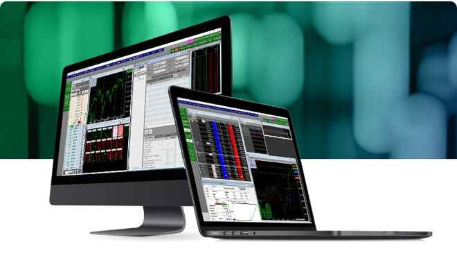
How to Read Candlestick Charts
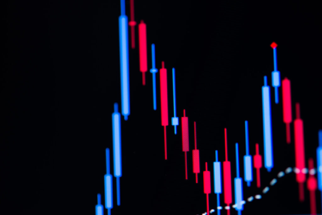
Before we get into the different types of candlestick chart analysis, we must first cover how to read them. The reading is quite simple, First, the trader creates a chart that looks at a certain time frame for the price movement of a security. Once they have that timeframe, the chart will be populated with candlesticks, and each candlestick will represent something different. The bottom of the body of the chart will indicate the open price during the selected time frame and this will turn red or green depending on the price action after open. Red means the price dropped, green means it went up. The candle at the top of the candlestick body will represent the highest price the security reached in the life of the candlestick chart. As time goes by new candles will be added, each one indicating the price of the security, it is up to the trader to follow the direction of these candles to determine where the price is headed.
What are the Most Popular Candlestick Chart Patterns?
There are many candlestick patterns available. You can learn about incorporating your own candlestick chart trading plan, but for the sake of simplicity, we will focus only on the most popular ones. Those being Doji, engulfing, bullish engulfing, and bearish engulfing
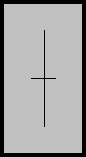
Doji Candlestick Patterns
Doji patterns are perhaps the easiest patterns to recognize because both the opening and closing candlesticks are so close to each other. This action makes the candles look very similar to a plus sign. Due to the open and close candles being so close together, this signals the end of either a buying pattern or selling pattern. A doji indicates that the latest movement of the chart has ended and the pattern is now neutral.
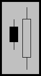
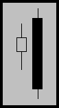
Engulfing Candlestick Pattern
An engulfing pattern is one of the more significant patterns you will see when looking at candlestick charts. An engulfing pattern occurs when the most recent candle completely engulfs the candle preceding it, thus signifying that buyers have dominated sellers, or sellers have dominated buyers.
Bullish Engulfing Pattern
As you may have guessed, a bullish engulfing pattern is a pattern that signals upward movement of a security. In this chart scenario, the most recent candle, completely engulfs the previous one and both wicks of the previous one are covered by this new one. This action signifies that buyers have dominated the sellers and suggests an upward movement in price. These patterns may also be seen near the end of a consolidation period.
Bearish Engulfing Pattern
Now that you know what a bullish engulfing pattern is, you can probably deduce what a bearish engulfing pattern is. If you guessed that a bearish engulfing pattern signifies the downward movement of a security, you’d be right. A bearish engulfing pattern occurs at the top of the market, and signifies a move down. This means the sellers have overpowered the buyers and identifies a bear market.
When to Use Candlestick Charts
While candlestick charts are a great tool for making a short-term decision, it is always recommended that you use other studies along with candlestick charts. Whether it be a trend-line fib analysis, or another type of technical analysis, the more the merrier. Remember a candlestick chart is a visual aid. It is not an end all be all type of analysis, they are best used in a small time frame where you are only taking a day or less into account.